网页制作实践 - 主体内容1 
作者:KK
发表日期:2016.1.31
本次实践主要练习的知识点:
浮动(float)
背景图平铺控制(background-repeat)
宽高控制
距离控制(margin,padding)
文字样式设置
浮动控制
图片嵌入排版
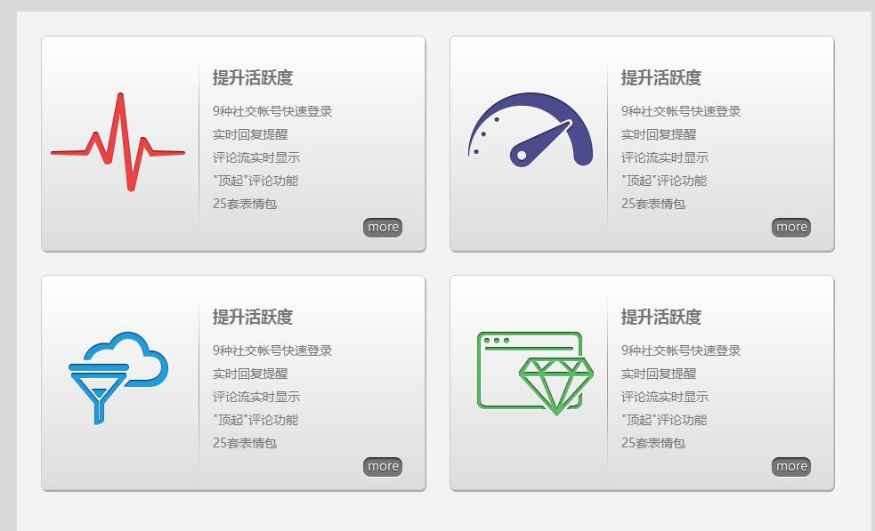
我们本次要制作的效果图如下:
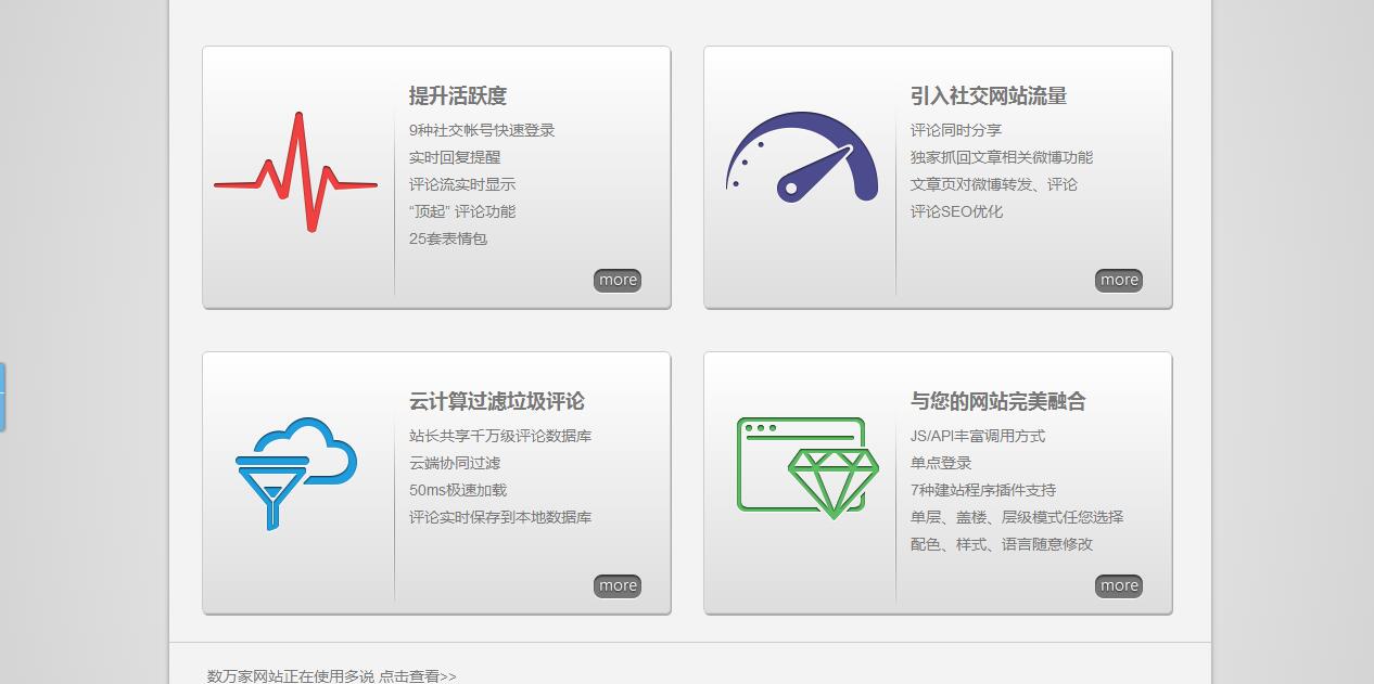
分析:这个是某网站的主体内容区域,主要有4大块小内容,而每一块的排版都是一样的
好了不废话我们马上开始干活,一边做一边慢慢分析它细节
第1步:实现大外框排版 
它的大布局就是主体内容大区域是960600像素,并且位于屏幕中间,所以我们需要一个960600的大容器并居中
<body>
<style type="text/css">
/*第1步的CSS*/
body{background:#DADADA;}
.main{width:960px; height:600px; background:#F3F3F3; margin:0 auto;}
</style>
<div class="main">
	随便填一些文字内容
</div>
</body>
第2步:实现小内容块的布局 
里面有4个小方框,分别是上面2个,下面2个,有2种做法
第1种是笨方法,就是既然上现各2个,就分成2行咯,每行写2个区域,这样:
<body>
<style type="text/css">
/*第1步的CSS*/
body{background:#DADADA;}
.main{width:960px; height:600px; background:#F3F3F3; margin:0 auto; padding-top:27px;}
</style>
<style type="text/css">
/*第2步-1的CSS*/
.line{height:250px; margin-bottom:27px;}
.lineItem{width:430px; height:240px; float:left; border:1px solid #000; margin-left:27px;}
</style>
<div class="main">
	<div class="line">
		<div class="lineItem"></div>
		<div class="lineItem"></div>
	</div>

	<div class="line">
		<div class="lineItem"></div>
		<div class="lineItem"></div>
	</div>
</div>
</body>
这样效果看起来有点粗糙,但起码是将大概的布局排了出来
但其实这个并不是最好的方式,下面我们再换一种思路:
<body>
<style type="text/css">
/*第1步的CSS*/
body{background:#DADADA;}
.main{width:960px; height:600px; background:#F3F3F3; margin:0 auto; padding:27px;}
</style>
<style type="text/css">
/*第2步-2的CSS*/
.main .item{width:430px; height:240px; float:left; border:1px solid #CCC; margin-right:27px;}
</style>
<div class="main">
	<div class="item"></div>
	<div class="item"></div>
	<div class="item"></div>
	<div class="item"></div>
</div>
</body>
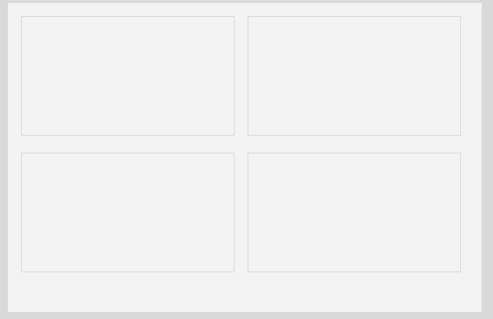
这样的效果也是几乎一样,只是思路就是在main里面直接放4个div,它们横行浮动(float:left),浮动的时候它们理论上是从左到右排的,但是由于main的容器不足以容纳3个以上并排,于是从第3个开始就换行显示了,于是也实现了2行的效果呀,而且总体代码量比之前的思路代码量少呢!
第3步:调整外框宽度 
这一步又回到外框这里来,为什么呢,因为你看我们现在实现出来的大外框竟然超出了960宽度,但效果图的就是只有960呀
其实原因就是因为外框有padding(内边距)属性,我这样演示是为了让你了解一个事情:padding会造成窗口大小增加,所以从960px+padding:27px的基础上就变成987咯
这时候你可能想到的办法就是将宽度减27就可以了,即定义宽度为931px,但实际上这并不可行,而且也不规范,具体我就不讲那么多,你可以先这样尝试,但你会很难调出效果
而正确的则是不要用padding,平时没啥事尽量别用,因为它会影响容器大小!加padding为了啥?就是为了让容器与里面的东西有点距离嘛,咱们反过来想,让里面的东西离容器边缘远一点就行咯
所以我们给里面的东西加margin(外边框)就行了
<body>
<style type="text/css">
/*第1步的CSS*/
body{background:#DADADA;}
.main{width:960px; height:600px; background:#F3F3F3; margin:0 auto; padding:27px;}
</style>
<style type="text/css">
/*第2步-2的CSS*/
.main .item{width:430px; height:240px; float:left; border:1px solid #CCC; margin-right:27px;}
</style>
<style type="text/css">
/*第3步-1的CSS*/
.main{padding:0 !important;}
.item{margin:27px 27px 0 0;}
</style>
<div class="main">
	<div class="item"></div>
	<div class="item"></div>
	<div class="item"></div>
	<div class="item"></div>
</div>
</body>
效果图:
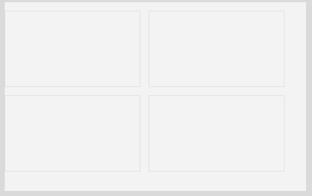
但这样也不对喔,左边跟main贴在一起啦!要给main加padding才能让它们离开点!可是我说了,不能随便用padding,这种情况也不要用哦
怎么办呢?好,这个.item{margin:27px 27px 0 0;}一次性描述了4个边距,分别顺序是上,右,下,左,就是上面和右边是外边距27像素,但下面和左边是没距离,现在不是左边贴了吗?只要给左边也加边距就行了吧!于是是不是应该写成.item{margin:27px 27px 0 27px;}呢?
呵呵这样也错啦,你可以试一下,如果这样做的话就会变成每个一行了,为什么呢?因为这样虽然实现了item的左边离main有27个像素,可是第2个item也离第2个item的左边有27像素,而第1个离右边也有27个,这样加起来两个item之间就会有54像素!
再来个想法,给item加左外边距造成了两个item之间的间隔变大,那么只给第1个加就行了是吗?.item:first-child{margin-left:27px;}你复制去看看,这样被挤到第2行的那个item就会没有左边距,也是贴住了main
所以给main加padding也不是.给item加margin也不是,办法就是给4个item包个容器,让这个容器设置与main的外边距,代码:
<body>
<style type="text/css">
/*第1步的CSS*/
body{background:#DADADA;}
.main{width:960px; height:600px; background:#F3F3F3; margin:0 auto; padding:27px;}
</style>
<style type="text/css">
/*第2步-2的CSS*/
.main .item{width:430px; height:240px; float:left; border:1px solid #CCC; margin-right:27px;}
</style>
<style type="text/css">
/*第3步-2的CSS*/
.main{padding:0 !important;} /*放弃第1步的padding*/
.items{width:100%; height:100%; margin:27px;}
.item{margin-top:27px;}
</style>
<div class="main">
	<div class="items">
		<div class="item"></div>
		<div class="item"></div>
		<div class="item"></div>
		<div class="item"></div>
	</div>
</div>
</body>
关键就是加了个 .items
第5步:实现小内容块(item)的排版 
由于里面4个小内容块都一样的排版,可以想到,我们只需要完成1个小块的样式,再将其它内容块的HTML结构设置成一样就可以,好吧我们先从第1个item下手
第5.1步:先将里面分成
左边和右边两块 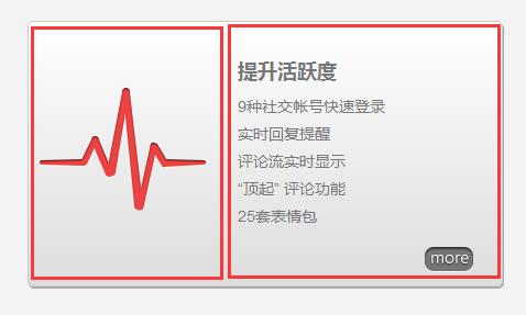
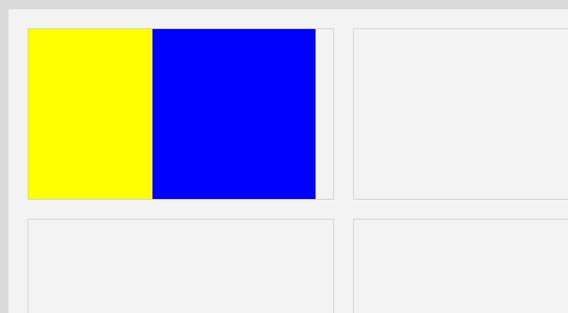
<body>
<style type="text/css">
/*第1步的CSS*/
body{background:#DADADA;}
.main{width:960px; height:600px; background:#F3F3F3; margin:0 auto; padding:27px;}
</style>
<style type="text/css">
/*第2步-2的CSS*/
.main .item{width:430px; height:240px; float:left; border:1px solid #CCC; margin-right:27px;}
</style>
<style type="text/css">
/*第3步-2的CSS*/
.main{padding:0 !important;} /*放弃第1步的padding*/
.items{width:100%; height:100%; margin:27px;}
.item{margin-top:27px;}
</style>
<style type="text/css">
/*第5.1步的CSS*/
.item .itemLeft{width:175px; height:100%; float:left; background:yellow;} /*左边*/
.item .itemRight{width:230px; height:100%; float:left; background:blue;} /*右边*/
</style>
<div class="main">
	<div class="items">
		<div class="item">
			<div class="itemLeft"></div>
			<div class="itemRight"></div>
		</div>
		<div class="item"></div>
		<div class="item"></div>
		<div class="item"></div>
	</div>
</div>
</body>
效果图:
第5.2步:添加item里面的左边图片 
由于4个内容块里面的图片都不同,所以不能为它们统一添加图片,而是为每个item添加一个不同的标记,再为这些标记添加不同的图片
这里我们通过背景图的方式来实现
<body>
<style type="text/css">
/*第1步的CSS*/
body{background:#DADADA;}
.main{width:960px; height:600px; background:#F3F3F3; margin:0 auto; padding:27px;}
</style>
<style type="text/css">
/*第2步-2的CSS*/
.main .item{width:430px; height:240px; float:left; border:1px solid #CCC; margin-right:27px;}
</style>
<style type="text/css">
/*第3步-2的CSS*/
.main{padding:0 !important;} /*放弃第1步的padding*/
.items{width:100%; height:100%; margin:27px;}
.item{margin-top:27px;}
</style>
<style type="text/css">
/*第5.1步的CSS*/
.item .itemLeft{width:175px; height:100%; float:left; background:yellow;}
.item .itemRight{width:230px; height:100%; float:left; background:blue;}
</style>
<style type="text/css">
/*第5.2步的CSS*/
.item.item1 .itemLeft{background:url(http://www.kkh86.com/it/html-base/img/preview/body1-step5-2.png);}
</style>
<div class="main">
	<div class="items">
		<div class="item item1">
			<div class="itemLeft"></div>
			<div class="itemRight"></div>
		</div>
		<div class="item item2"></div>
		<div class="item item3"></div>
		<div class="item item4"></div>
	</div>
</div>
</body>
效果图:

可是这样不对呀,哦!试下加
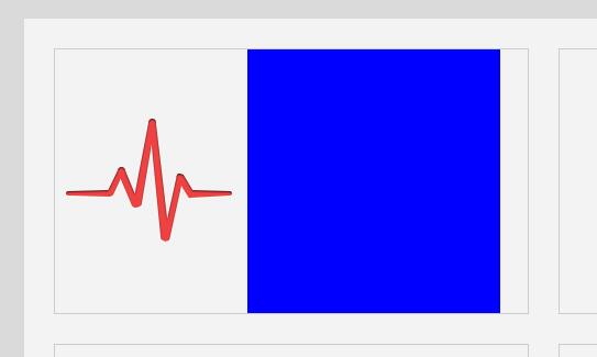
background-repeat:no-repeat;,然后效果成了这样: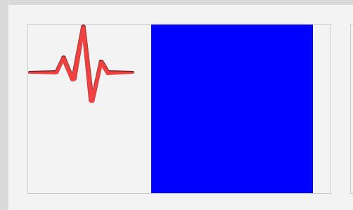
虽然背景没有重复了,但是背景怎么把它弄下去呢?
办法1:用相对定位,往下偏移调整,但不提倡这样
办法2:不要用背景图了,用img标签嵌入图片,再让img标签添加margin-top顶下去,好了就决定这样做吧,虽然也不是最好的办法
(提示:最好的办法还是使用背景图!但这里先不讲这么深!)
代码:
<body>
<style type="text/css">
/*第1步的CSS*/
body{background:#DADADA;}
.main{width:960px; height:600px; background:#F3F3F3; margin:0 auto; padding:27px;}
</style>
<style type="text/css">
/*第2步-2的CSS*/
.main .item{width:430px; height:240px; float:left; border:1px solid #CCC; margin-right:27px;}
</style>
<style type="text/css">
/*第3步-2的CSS*/
.main{padding:0 !important;} /*放弃第1步的padding*/
.items{width:100%; height:100%; margin:27px;}
.item{margin-top:27px;}
</style>
<style type="text/css">
/*第5.1步的CSS*/
.item .itemLeft{width:175px; height:100%; float:left; background:yellow;}
.item .itemRight{width:230px; height:100%; float:left; background:blue;}
</style>
<style type="text/css">
/*第5.2步的CSS*/
.item.item1 .itemLeft{background:none;} /**去掉5.1步的黄色背景*/
.item.item1 .itemLeft img{margin-top:63px; margin-left:10px;}
</style>
<div class="main">
	<div class="items">
		<div class="item item1">
			<div class="itemLeft">
				<img src="http://www.kkh86.com/it/html-base/img/preview/body1-step5-2.png" />
			</div>
			<div class="itemRight"></div>
		</div>
		<div class="item item2"></div>
		<div class="item item3"></div>
		<div class="item item4"></div>
	</div>
</div>
</body>
效果图,还好吧:
5.3步:填充item的右边文字内容 
这个非常好办!里面分别是一个大标题,下面就几行字
<body>
<style type="text/css">
/*第1步的CSS*/
/*reset开始*/
*{margin:0; padding:0;}
a{text-decoration:none;}
ul{list-style:none;}
/*reset结束*/
body{background:#DADADA;}
.main{width:960px; height:600px; background:#F3F3F3; margin:0 auto; padding:27px;}
</style>
<style type="text/css">
/*第2步-2的CSS*/
.main .item{width:430px; height:240px; float:left; border:1px solid #CCC; margin-right:27px;}
</style>
<style type="text/css">
/*第3步-2的CSS*/
.main{padding:0 !important;} /*放弃第1步的padding*/
.items{width:100%; height:100%; margin:27px;}
.item{margin-top:27px;}
</style>
<style type="text/css">
/*第5.1步的CSS*/
.item .itemLeft{width:175px; height:100%; float:left; background:yellow;}
.item .itemRight{width:230px; height:100%; float:left; background:blue;}
</style>
<style type="text/css">
/*第5.2步的CSS*/
.item .itemLeft{background:none;} /**去掉5.1步的黄色背景*/
.item .itemLeft img{margin-top:63px; margin-left:10px;}
</style>
<style type="text/css">
/*第5.3步的CSS*/
.item .itemRight{background:none; color:#777; font-family:"微软雅黑";} /**去掉5.1步的蓝色背景,并设置灰色字体*/
.item h4{font-size:17.5px; margin-top:33px; margin-bottom:15px;}
.item p{margin-top:6px; font-size:14px;}
</style>
<div class="main">
	<div class="items">
		<div class="item item1">
			<div class="itemLeft">
				<img src="http://www.kkh86.com/it/html-base/img/preview/body1-step5-2.png" />
			</div>
			<div class="itemRight">
				<!--第5.3步新增内容-->
				<h4>提升活跃度</h4>
				<p>9种社交帐号快速登录</p>
				<p>实时回复提醒</p>
				<p>评论流实时显示</p>
				<p>"顶起"评论功能</p>
				<p>25套表情包</p>
			</div>
		</div>
		<div class="item item2"></div>
		<div class="item item3"></div>
		<div class="item item4"></div>
	</div>
</div>
</body>
其实没什么浮动排版的功夫,就是直接添加文字标签再调整字体样式,效果图:

第5.4步:完善item框 
接下来我们需要完善item框的背景以及里面左边图片和右边文字内容之间的那条竖线,背景图就像是之前导航条的背景一样,用一张小背景图片对item进行横向平铺就可以了.而中间竖线就让它作为itemRight的背景图片,并且不重复(因为这条竖线是带渐变的,我们暂不使用CSS来实现渐变,而是用渐变的图片)
<body>
<style type="text/css">
/*第1步的CSS*/
/*reset开始*/
*{margin:0; padding:0;}
a{text-decoration:none;}
ul{list-style:none;}
/*reset结束*/
body{background:#DADADA;}
.main{width:960px; height:600px; background:#F3F3F3; margin:0 auto; padding:27px;}
</style>
<style type="text/css">
/*第2步-2的CSS*/
.main .item{width:430px; height:240px; float:left; border:1px solid #CCC; margin-right:27px;}
</style>
<style type="text/css">
/*第3步-2的CSS*/
.main{padding:0 !important;} /*放弃第1步的padding*/
.items{width:100%; height:100%; margin:27px;}
.item{margin-top:27px;}
</style>
<style type="text/css">
/*第5.1步的CSS*/
.item .itemLeft{width:175px; height:100%; float:left; background:yellow;}
.item .itemRight{width:230px; height:100%; float:left; background:blue;}
</style>
<style type="text/css">
/*第5.2步的CSS*/
.item .itemLeft{background:none;} /**去掉5.1步的黄色背景*/
.item .itemLeft img{margin-top:63px; margin-left:10px;}
</style>
<style type="text/css">
/*第5.3步的CSS*/
.item .itemRight{background:none; color:#777; font-family:"微软雅黑";} /**去掉5.1步的蓝色背景,并设置灰色字体*/
.item h4{font-size:17.5px; margin-top:33px; margin-bottom:15px;}
.item p{margin-top:6px; font-size:14px;}
</style>
<style type="text/css">
/*第5.4步的CSS*/
.item{
	background:url(http://www.kkh86.com/it/html-base/img/preview/body1-step5-8.jpg) repeat-x;
	border-radius:6px; /*圆角*/
	box-shadow:1px 2px 0px rgba(0, 0, 0, 0.3); /*这个是阴影,效果图中的item是有阴影的哦!不过我没教过这个样式,少用,感兴趣就自己上网查吧*/
}
.item .itemRight{
	background:url(http://www.kkh86.com/it/html-base/img/preview/body1-step5-9.png) no-repeat;
	padding-left:17px; /*不要随便用padding是因为防止把自己撑大,但这里把自己撑大无所谓,外面不会变形就好*/
	position:relative; /*如果这里不加relative相对定位,那么下面img的绝对定位就会相对于body里绝对定位咯*/
}

.item .itemRight img{position:absolute; right:17px; bottom:13px;}

/*下面微调一下各个大图标的左外边距*/
.items .item2 img{margin-left:20px;}
.items .item3 img,.items .item4 img{margin-left:30px;}
</style>
<div class="main">
	<div class="items">
		<div class="item item1">
			<div class="itemLeft">
				<img src="http://www.kkh86.com/it/html-base/img/preview/body1-step5-2.png" />
			</div>
			<div class="itemRight">
				<!--第5.3步新增内容-->
				<h4>提升活跃度</h4>
				<p>9种社交帐号快速登录</p>
				<p>实时回复提醒</p>
				<p>评论流实时显示</p>
				<p>"顶起"评论功能</p>
				<p>25套表情包</p>

				<img src="http://www.kkh86.com/it/html-base/img/preview/body1-more.png" />
			</div>
		</div>

		<div class="item item2">
			<div class="itemLeft">
				<img src="http://www.kkh86.com/it/html-base/img/preview/body1-step5-10.png" />
			</div>
			<div class="itemRight">
				<!--从第5.3步复制进来的内容-->
				<h4>提升活跃度</h4>
				<p>9种社交帐号快速登录</p>
				<p>实时回复提醒</p>
				<p>评论流实时显示</p>
				<p>"顶起"评论功能</p>
				<p>25套表情包</p>

				<img src="http://www.kkh86.com/it/html-base/img/preview/body1-more.png" />
			</div>
		</div>

		<div class="item item3">
			<div class="itemLeft">
				<img src="http://www.kkh86.com/it/html-base/img/preview/body1-step5-11.png" />
			</div>
			<div class="itemRight">
				<!--从第5.3步复制进来的内容-->
				<h4>提升活跃度</h4>
				<p>9种社交帐号快速登录</p>
				<p>实时回复提醒</p>
				<p>评论流实时显示</p>
				<p>"顶起"评论功能</p>
				<p>25套表情包</p>

				<img src="http://www.kkh86.com/it/html-base/img/preview/body1-more.png" />
			</div>
		</div>

		<div class="item item4">
			<div class="itemLeft">
				<img src="http://www.kkh86.com/it/html-base/img/preview/body1-step5-12.png" />
			</div>
			<div class="itemRight">
				<!--从第5.3步复制进来的内容-->
				<h4>提升活跃度</h4>
				<p>9种社交帐号快速登录</p>
				<p>实时回复提醒</p>
				<p>评论流实时显示</p>
				<p>"顶起"评论功能</p>
				<p>25套表情包</p>

				<img src="http://www.kkh86.com/it/html-base/img/preview/body1-more.png" />
			</div>
		</div>
	</div>
</div>
</body>
效果图:
其实跟效果图还是有一点点差距,但这个已经不重要,主要想教会你的已经在这个实践中了!还有些细节你想完全模仿的话可以自己尝试一下
最后整理一下代码:
<body>
<style type="text/css">
/*reset开始*/
*{margin:0; padding:0;}
a{text-decoration:none;}
ul{list-style:none;}
/*reset结束*/
body{background:#DADADA;}
.main{width:960px; height:600px; background:#F3F3F3; margin:0 auto;}
.main .items{width:100%; height:100%; margin:27px;}
.main .item{
	width:430px;
	height:240px;
	float:left;
	border:1px solid #CCC;
	margin-right:27px;
	margin-top:27px;
	background:url(http://www.kkh86.com/it/html-base/img/preview/body1-step5-8.jpg) repeat-x;
	border-radius:6px; /*圆角*/
	box-shadow:1px 2px 0px rgba(0, 0, 0, 0.3); /*这个是阴影,效果图中的item是有阴影的哦!不过我没教过这个样式,少用,感兴趣就自己上网查吧*/
}
.item .itemLeft{width:175px; height:100%; float:left;}
.item .itemLeft img{margin-top:63px; margin-left:10px;}
.item h4{font-size:17.5px; margin-top:33px; margin-bottom:15px;}
.item p{margin-top:6px; font-size:14px;}
.item .itemRight{
	width:230px;
	height:100%;
	float:left;
	color:#777;
	font-family:"微软雅黑";
	background:url(http://www.kkh86.com/it/html-base/img/preview/body1-step5-9.png) no-repeat;
	padding-left:17px; /*不要随便用padding是因为防止把自己撑大,但这里把自己撑大无所谓,外面不会变形就好*/
	position:relative; /*如果这里不加relative相对定位,那么下面img的绝对定位就会相对于body里绝对定位咯*/
}
.item .itemRight img{position:absolute; right:17px; bottom:13px;}

/*下面微调一下各个大图标的左外边距*/
.items .item2 img{margin-left:20px;}
.items .item3 img,.items .item4 img{margin-left:30px;}
</style>
<div class="main">
	<div class="items">
		<div class="item item1">
			<div class="itemLeft">
				<img src="http://www.kkh86.com/it/html-base/img/preview/body1-step5-2.png" />
			</div>
			<div class="itemRight">
				<!--第5.3步新增内容-->
				<h4>提升活跃度</h4>
				<p>9种社交帐号快速登录</p>
				<p>实时回复提醒</p>
				<p>评论流实时显示</p>
				<p>"顶起"评论功能</p>
				<p>25套表情包</p>

				<img src="http://www.kkh86.com/it/html-base/img/preview/body1-more.png" />
			</div>
		</div>

		<div class="item item2">
			<div class="itemLeft">
				<img src="http://www.kkh86.com/it/html-base/img/preview/body1-step5-10.png" />
			</div>
			<div class="itemRight">
				<!--从第5.3步复制进来的内容-->
				<h4>提升活跃度</h4>
				<p>9种社交帐号快速登录</p>
				<p>实时回复提醒</p>
				<p>评论流实时显示</p>
				<p>"顶起"评论功能</p>
				<p>25套表情包</p>

				<img src="http://www.kkh86.com/it/html-base/img/preview/body1-more.png" />
			</div>
		</div>

		<div class="item item3">
			<div class="itemLeft">
				<img src="http://www.kkh86.com/it/html-base/img/preview/body1-step5-11.png" />
			</div>
			<div class="itemRight">
				<!--从第5.3步复制进来的内容-->
				<h4>提升活跃度</h4>
				<p>9种社交帐号快速登录</p>
				<p>实时回复提醒</p>
				<p>评论流实时显示</p>
				<p>"顶起"评论功能</p>
				<p>25套表情包</p>

				<img src="http://www.kkh86.com/it/html-base/img/preview/body1-more.png" />
			</div>
		</div>

		<div class="item item4">
			<div class="itemLeft">
				<img src="http://www.kkh86.com/it/html-base/img/preview/body1-step5-12.png" />
			</div>
			<div class="itemRight">
				<!--从第5.3步复制进来的内容-->
				<h4>提升活跃度</h4>
				<p>9种社交帐号快速登录</p>
				<p>实时回复提醒</p>
				<p>评论流实时显示</p>
				<p>"顶起"评论功能</p>
				<p>25套表情包</p>

				<img src="http://www.kkh86.com/it/html-base/img/preview/body1-more.png" />
			</div>
		</div>
	</div>
</div>
</body>